My brother decided to open an Inn in Idrija. He’s done very well in regards to making everything happen, but he needed a good design to go along with it.

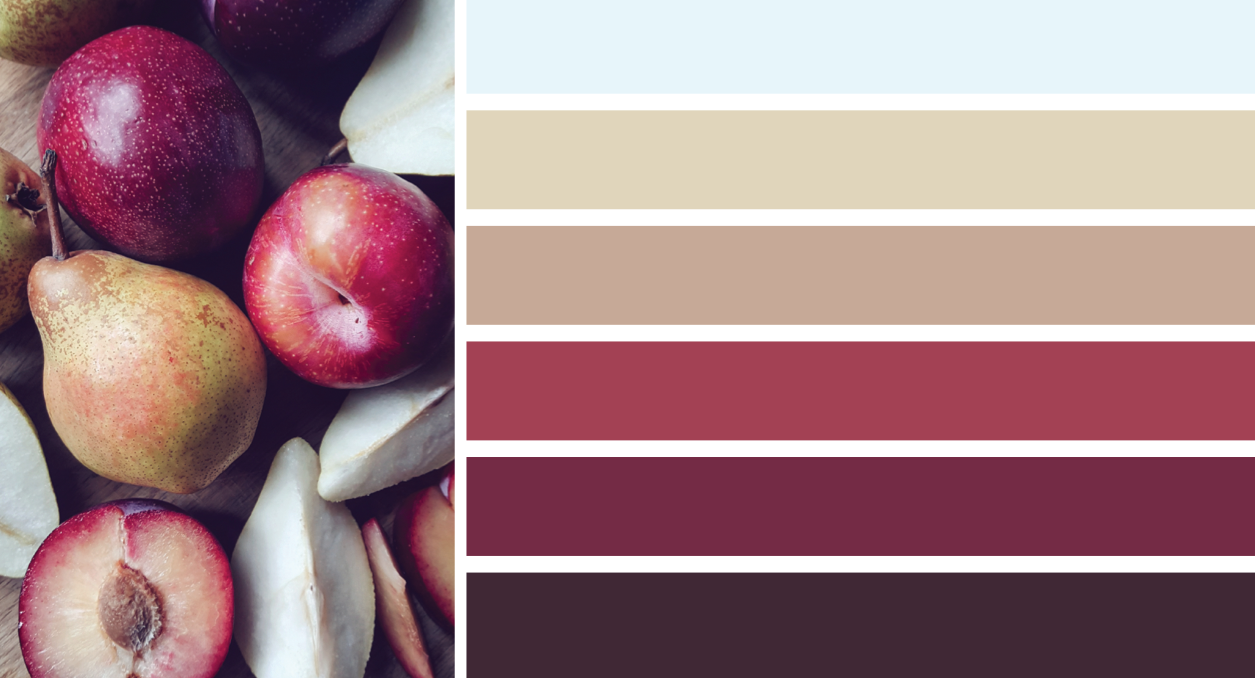
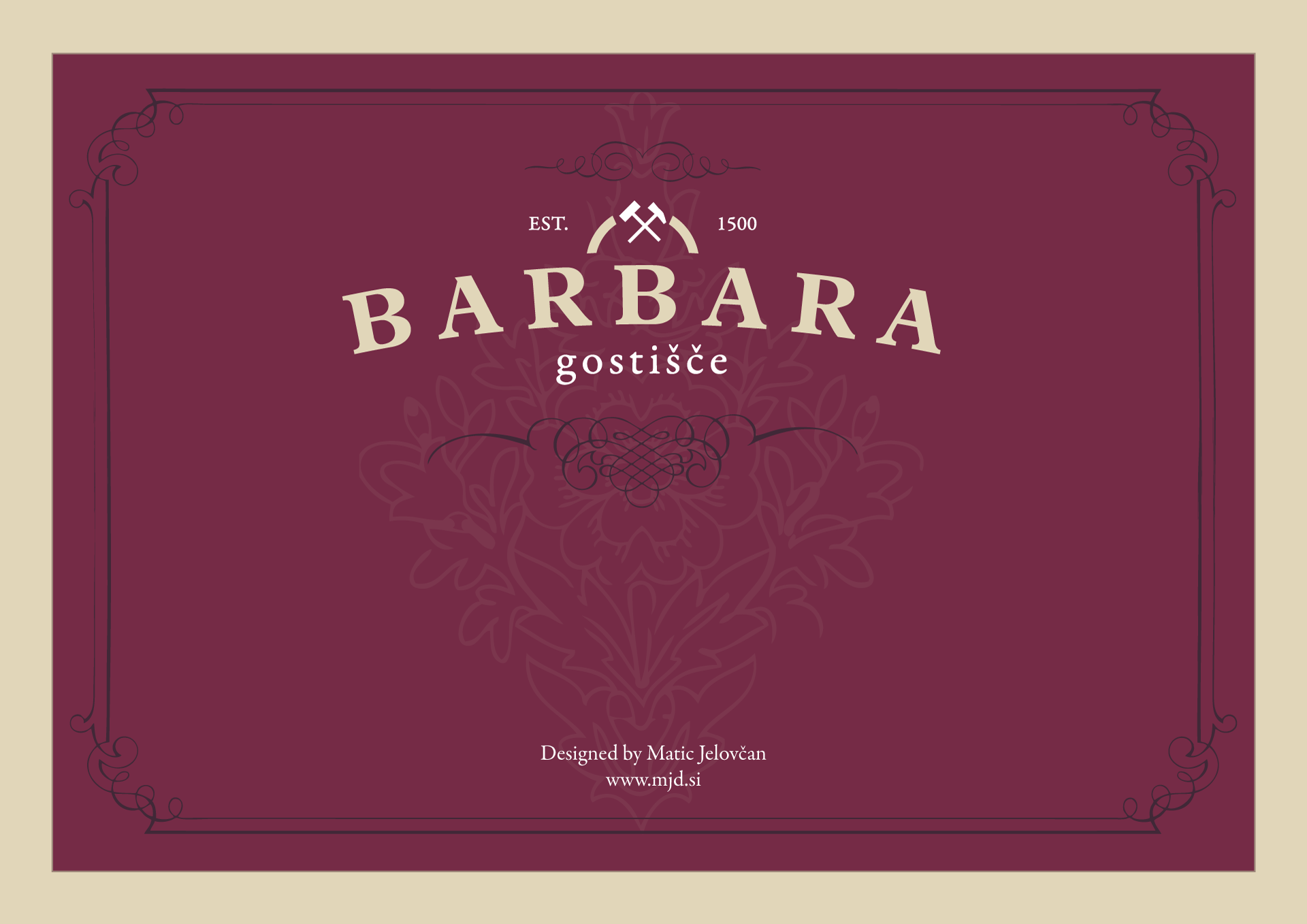
I decided to start off with autumn colours that have some archaic subtone. I went this route because the building, wherein the Inn is located, is above a mine that goes back to 1500s. That is also why the above logo, which is the simplified version of the mine logo, which had to be included, has “Established in 1500.” Even though the Inn doesn’t officially go back that far, the building does and there has always been some formal and informal sleeping and pub arrangements done upstairs, where the Inn is now located.

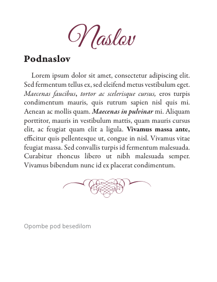
Logo had to also be done in way, that it would be reflective of the higher-end food, that is served in the Inn, as well as the being reflective of the age of the business and the building. Thereby I chose a classic fonts Palatino and Adobe Garamond for the Logo. Garamond was also used later in the typography as well, with OpenSans to be used on digital publications or as references and GreatVibes as a Heading font that fits with most other graphical elements that have been adapted from penmanship decorations from 19th century.

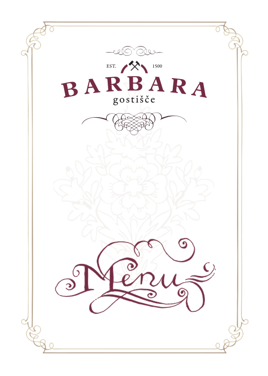
In some instances, menus for example, I even added some of my own penmanship skills, which albeit limited due to only two months practice was sufficient for what I was aiming for.


