A Long-Term Design Relationship
Some design projects are measured in weeks. Others unfold over years.
My collaboration with the Bible Society of Slovenia belongs firmly to the latter category.
What began with the refinement of an existing visual identity gradually expanded into a broader design language spanning Bible editions, donor communication, newsletters, stationery, printed publications, and digital media. The challenge was never simply to create individual artefacts, but to help an institution communicate consistently across a wide range of audiences and formats while remaining recognisable to generations of readers.
Rather than replacing established visual traditions, the work focused on understanding what already carried meaning and strengthening those elements through a more coherent typographic and visual system.
Building Upon Existing Foundations
The visual identity was not created from a blank sheet of paper.
For many readers, one of the most recognisable visual elements of the Bible Society was already the symbol associated with the Slovene Standard Translation (SSP) of the Bible. The task therefore was not reinvention, but refinement.
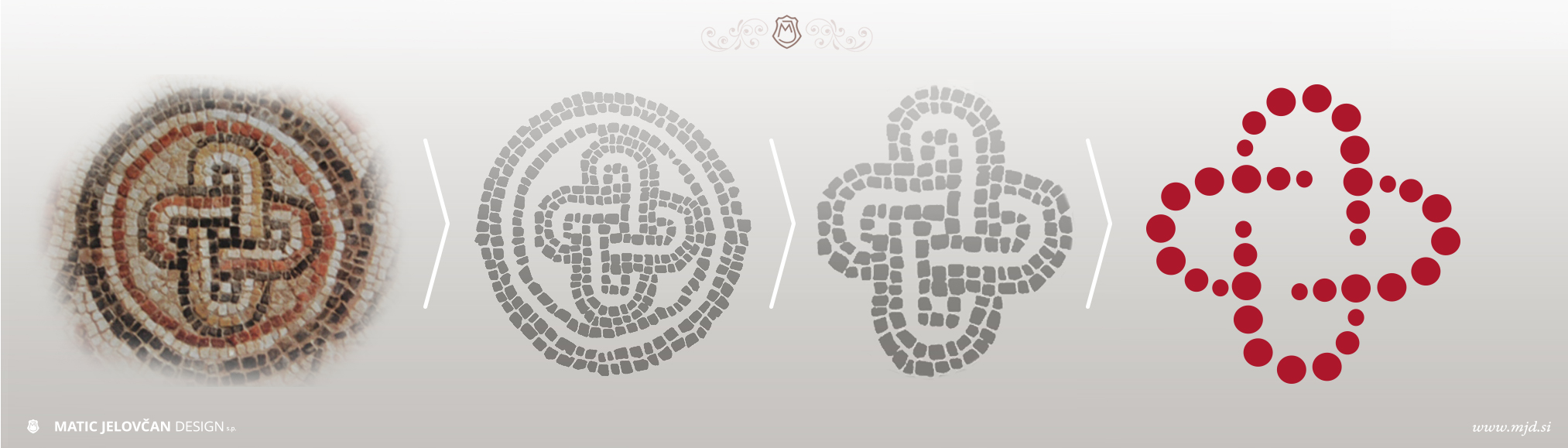
The symbol itself draws inspiration from a mosaic found in the early Christian baptistry of ancient Emona, present-day Ljubljana. Through careful simplification and systematisation, the mark was adapted into a more flexible identity element while retaining its historical and symbolic associations.
This continuity proved important. Readers were able to recognise familiar elements while the organisation gained a more coherent and adaptable visual language.
Typography as Infrastructure
Visual identities often focus on logos, but institutions communicate primarily through text.
For that reason, typography became one of the central components of the redesign.
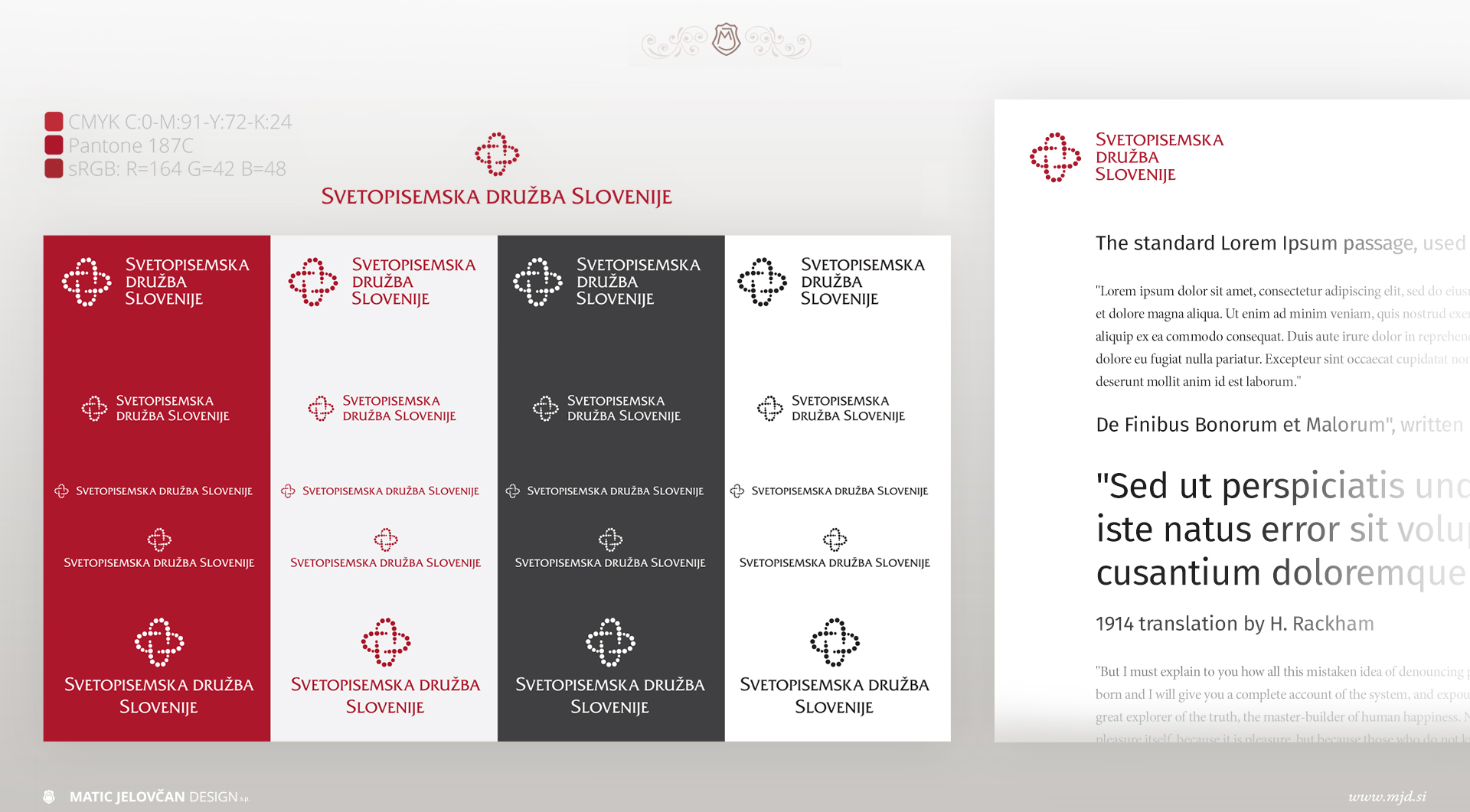
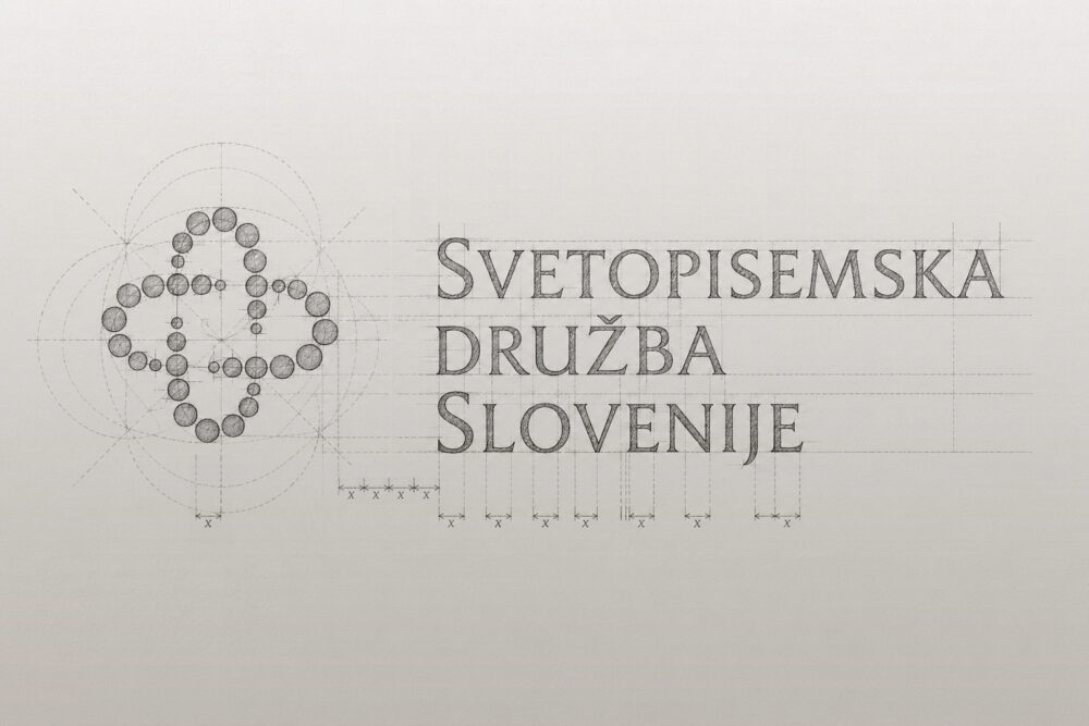
The logotype retained Friz Quadrata, a typeface already closely associated with Bible Society publications. Its classical character connects naturally with traditional book typography and works particularly well alongside typefaces such as Garamond, Karmina, Palatino and other elegant and timeless typefaces.
For broader communication, Fira Sans was introduced as the primary supporting typeface.
Its strengths include:
- Excellent screen readability
- Extensive weight range
- Strong multilingual support
- Flexibility across formal and informal contexts
Together, these typefaces established a system capable of functioning across printed publications, correspondence, educational materials, donor communication, websites, and social media.
The objective was not stylistic consistency alone, but communicative clarity.
Designing for Many Audiences
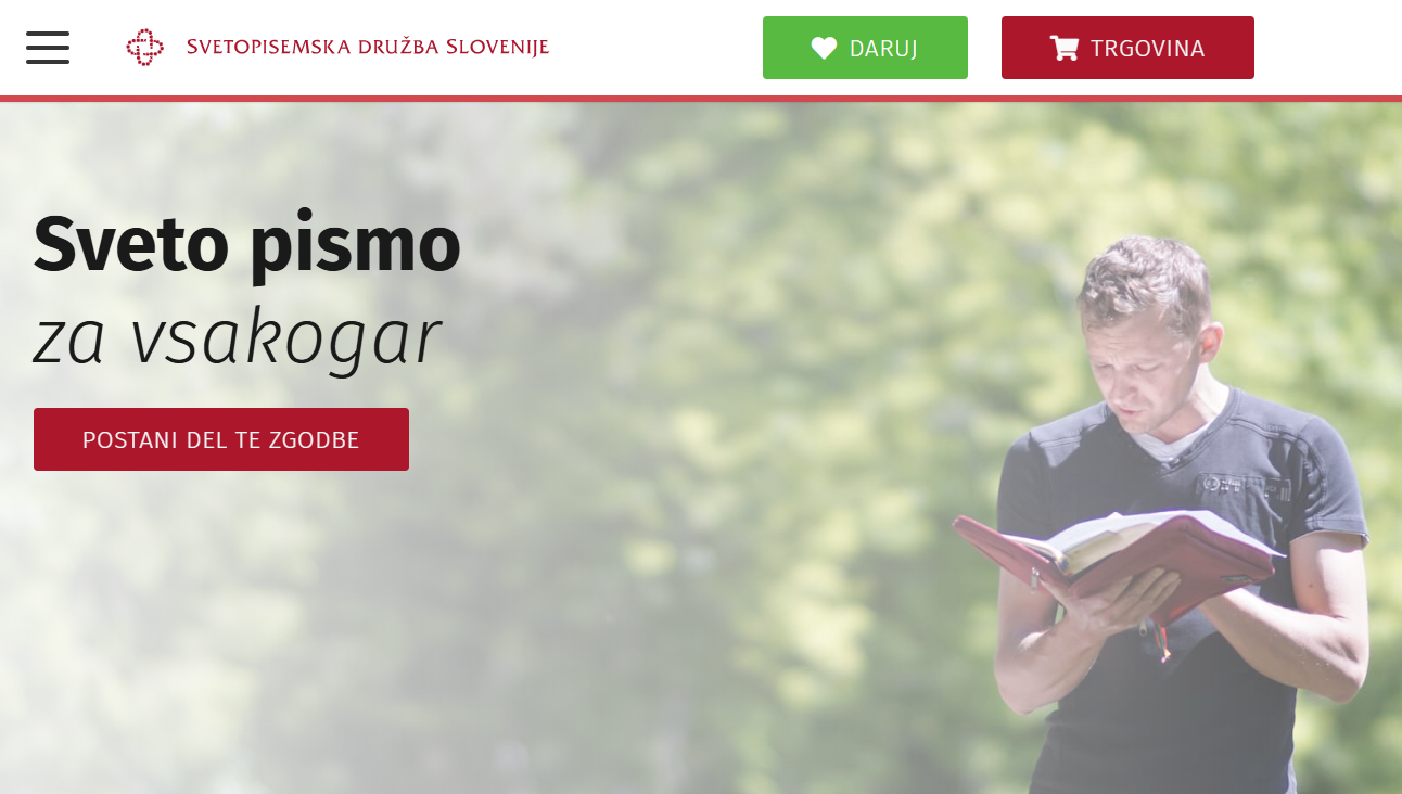
One of the unique challenges of the Bible Society is the diversity of its audiences.
The organisation communicates with:
- Church communities
- Individual readers
- Donors
- Educators
- Young people
- Publishers
- Partner organisations
A visual language that works for one audience may not work for another.
The system therefore needed sufficient structure to remain recognisable while also allowing flexibility in tone and application.
This balance enabled the same identity to appear equally at home on a formal annual publication, a donor appeal, a youth-oriented Bible edition, or a digital communication campaign.
Beyond the Logo
Over time, the visual system was applied to a broad range of materials, including:
- Bible editions
- Donor communication
- Letterheads and stationery
- Printed publications
- Promotional materials
- Event materials
- Newsletters
- Educational resources
Particular attention was given to the relationship between typography, hierarchy, navigation, and readability.
This was especially important for publications where readers engage with content repeatedly over long periods of time.
Bible Design
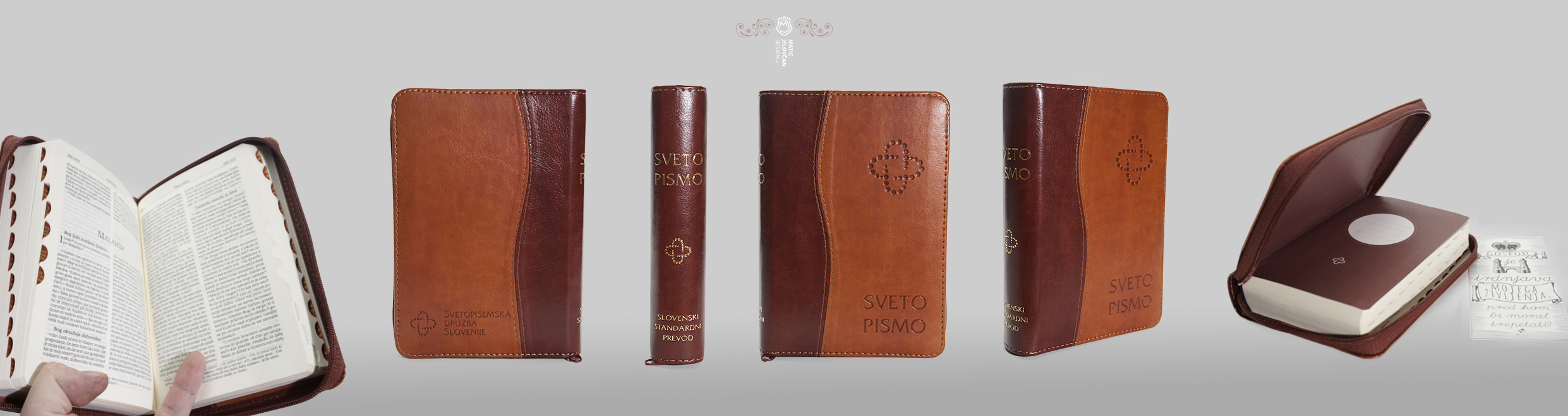
Among the most rewarding aspects of this collaboration was the opportunity to design multiple Bible editions.
Unlike many publications, Bibles are often read, referenced, annotated, and returned to over many years. Their design therefore requires careful consideration of hierarchy, navigation, readability, note-taking, and physical production.
Each edition presented its own challenges while remaining connected to the broader visual language of the institution.
The goal was always the same: to help readers engage with the text as clearly and comfortably as possible.
Stewardship Rather Than Reinvention
Looking back, the most valuable lesson from this work is that institutional design is rarely about creating something entirely new.
More often, it involves recognising what already carries meaning, understanding why it matters, and helping it function more effectively in changing circumstances.
The Bible Society of Slovenia had a rich visual and cultural heritage long before my involvement. My role was to help shape, clarify, and extend that legacy across a changing communication landscape.
Good institutional design is not merely about appearance.
It is about creating systems that remain useful, recognisable, and meaningful over time.