Design systems that live in the real world rarely remain static.
As printing cycles continue and user expectations shift, long-standing publications require careful updates that extend rather than replace what already exists.
The 2023 reprints of the Slovene Standard Translation (SSP) Bible were not a redesign of the system, but an incremental evolution of its visual and material language.
The goal was to expand the range of editions while preserving their recognisability as a coherent family.
Luxury edition: introducing material variation
In the luxury line, the focus was on subtle material and colour exploration within an established format.
For the first time, a white leather edition was introduced alongside existing black and red variants.
This was not a stylistic departure, but a controlled expansion of the system’s material range.
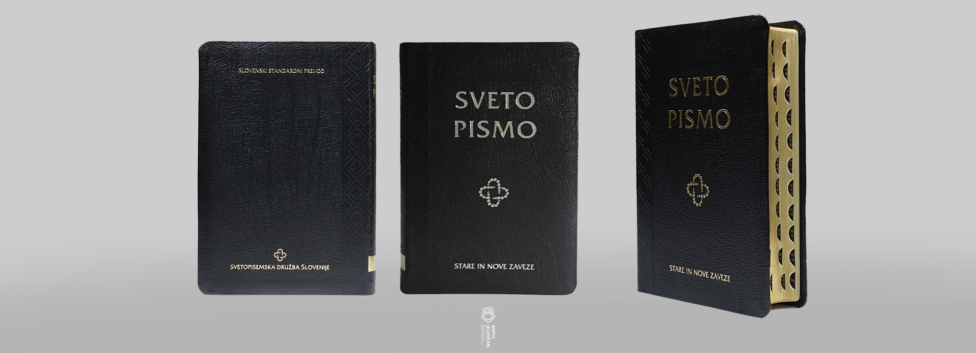
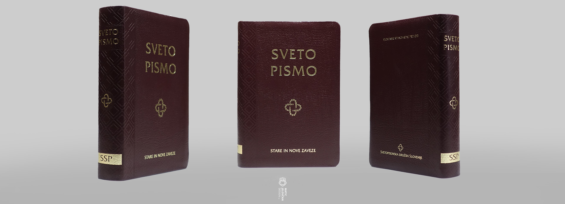
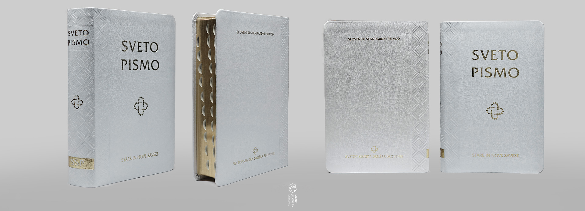
The intention was to explore how far the identity can stretch while still remaining clearly part of the same series.
Hardcover editions: refining the mid-tier system
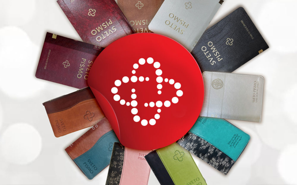
The hardcover and PU editions received additional colour variations, including new tones that extend the existing palette.
This included:
- updated red faux leather (PU) variant
- a new red balacron hardcover option
- a lighter cherrywood-brown hardcover variation
These adjustments were not introduced as isolated design decisions, but as part of maintaining balance within the broader product hierarchy.
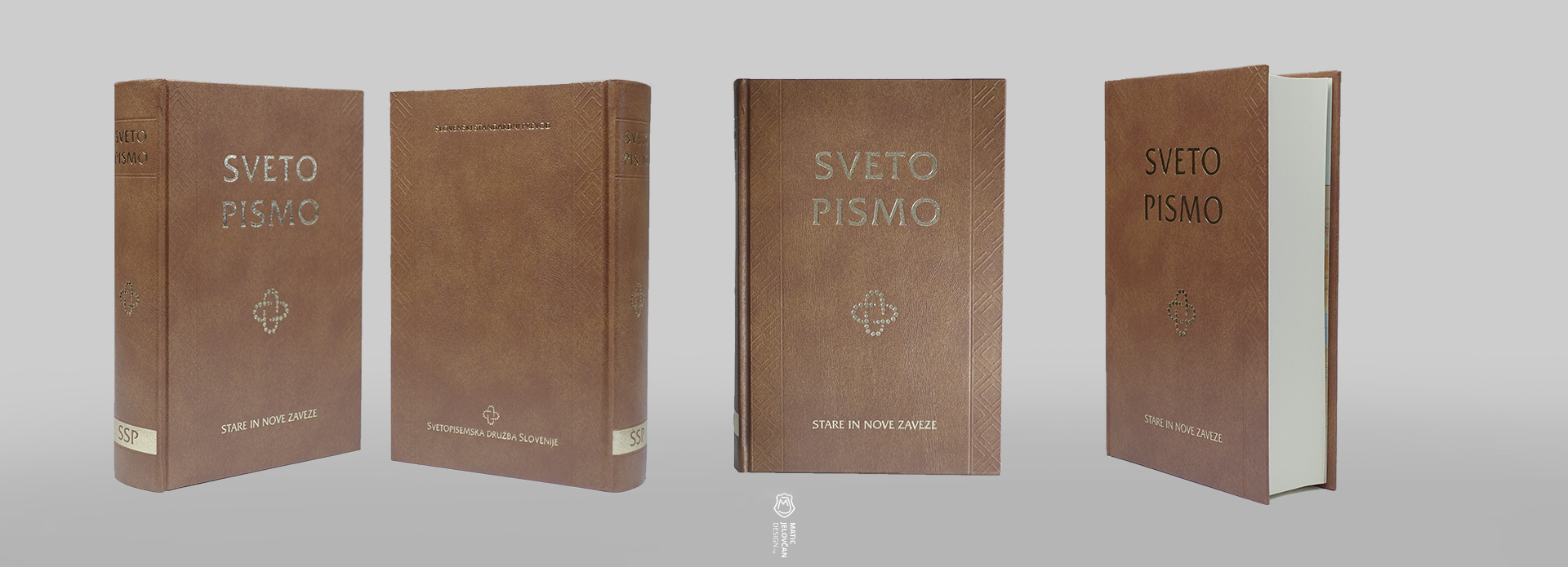
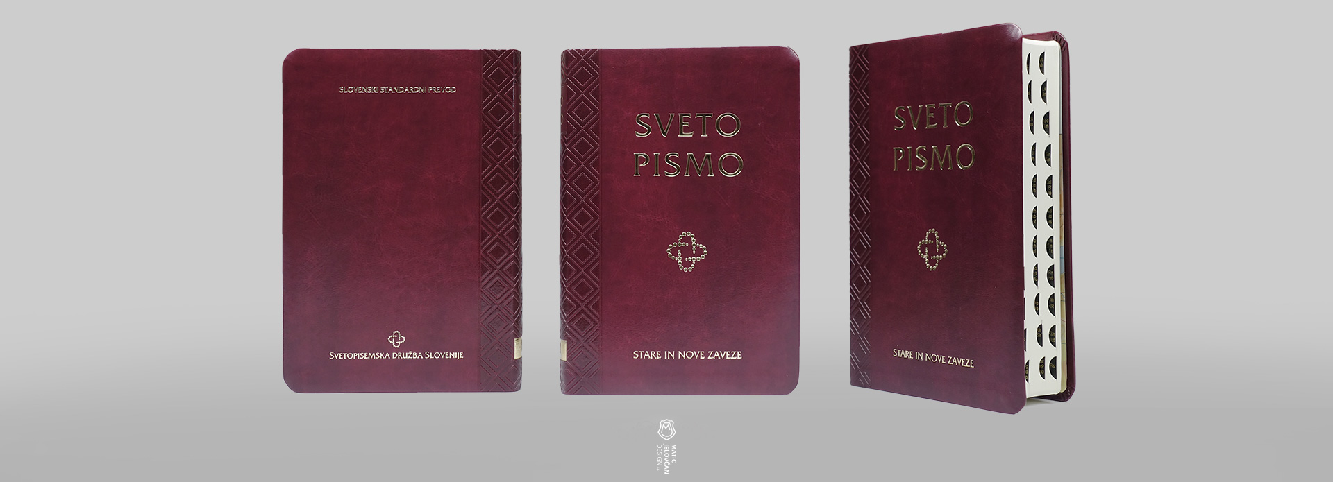
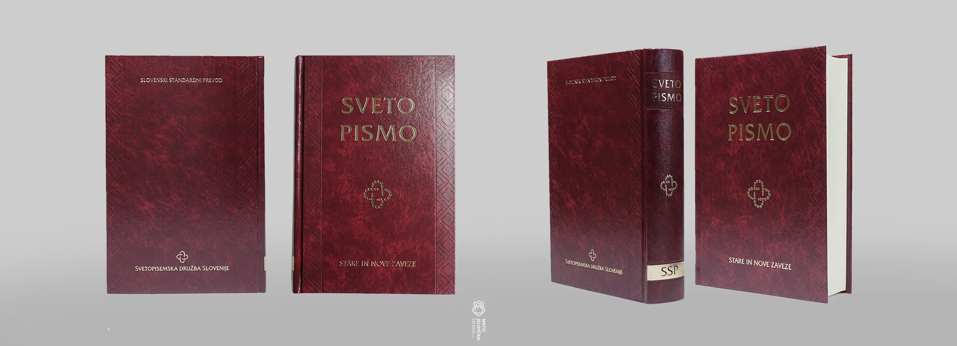
Each addition serves to refine the internal structure of the system, ensuring clarity across different price and material tiers.
Pocket editions: expanding accessibility and variation
The pocket editions continued to evolve as the most diverse and accessible format within the system.
This update introduced three new combinations:
- white leather with zipper
- turquoise-brown bi-material version
- turquoise variant with patterned spine detail
These variations extend the reach of the system while maintaining consistency in format and construction.
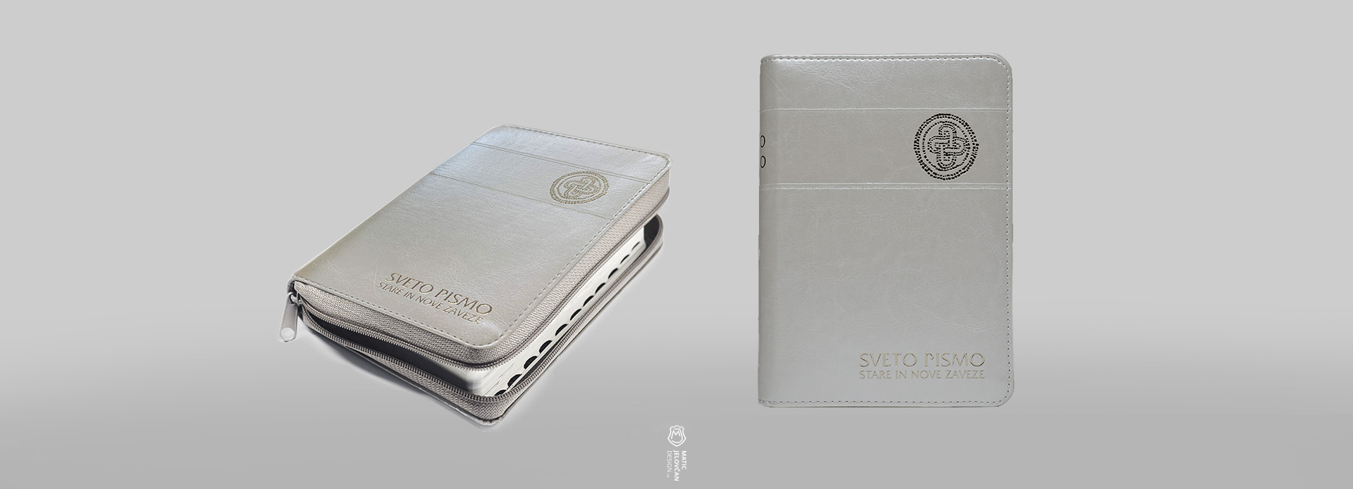
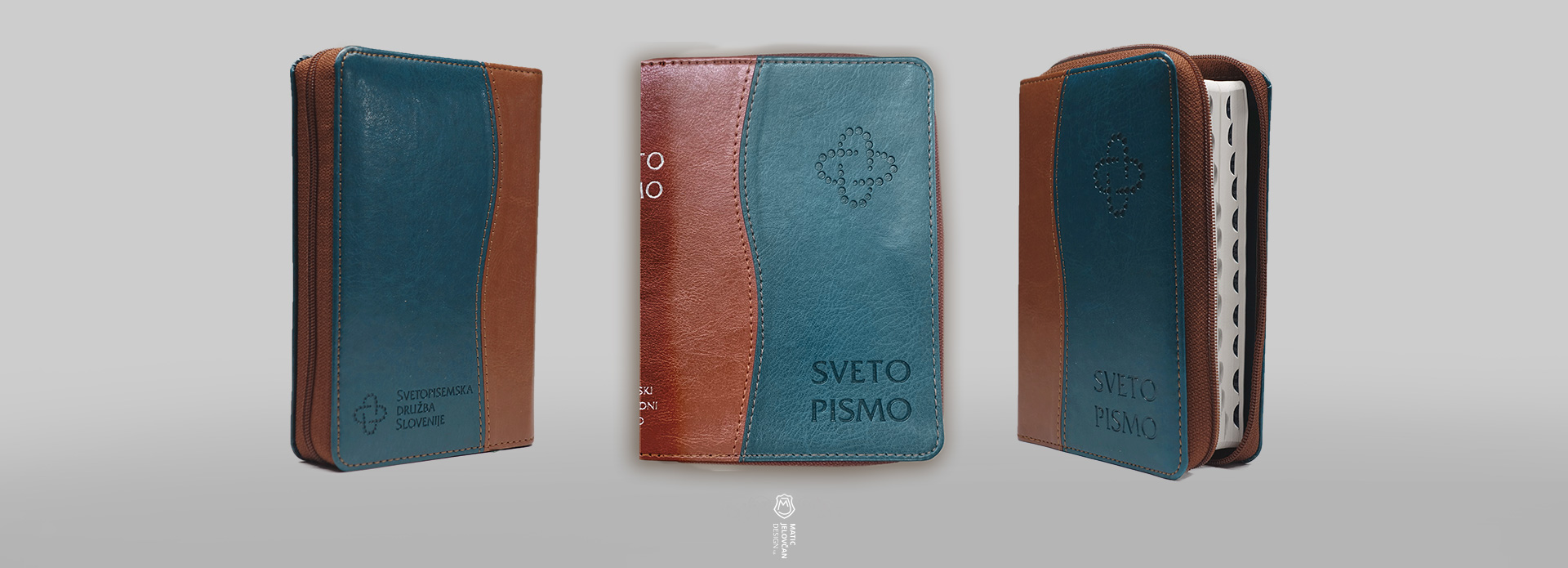
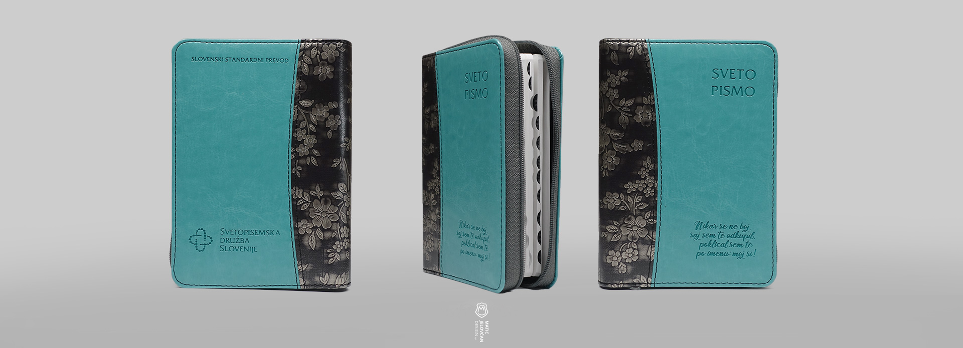
In this category, variation is not decorative—it functions as differentiation within a clearly defined product family.
Design as controlled variation
Across all editions, the underlying principle remains consistent:
A strong system does not depend on uniformity, but on controlled variation.
Each new colour, material, or combination is evaluated not in isolation, but in relation to:
- the existing hierarchy of editions
- the recognisability of the system
- and the clarity of distinctions between formats
As the system grows, design becomes less about introducing novelty and more about maintaining coherence under change.
Closing note
These updates represent incremental steps in the ongoing development of a long-term publication system—one that must remain both familiar and adaptable as it evolves.