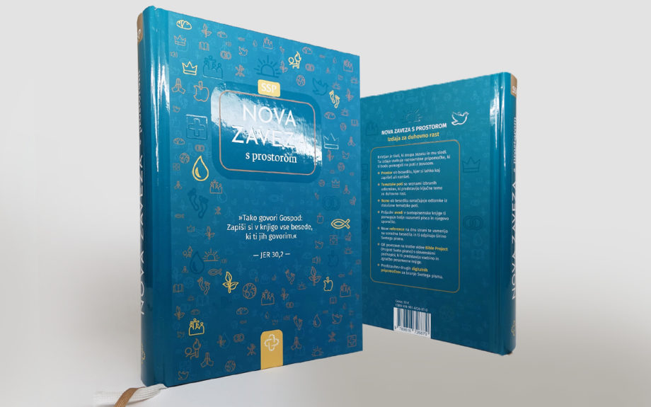
The Bible Society of Slovenia recently published a new edition of the Bible featuring both a newly designed cover and a completely reimagined interior layout, a project I had the privilege of designing.
Designing a Bible presents a unique challenge. Readers often have long-established expectations regarding navigation, typography, hierarchy, and the overall reading experience. Any changes must improve usability without disrupting familiarity.
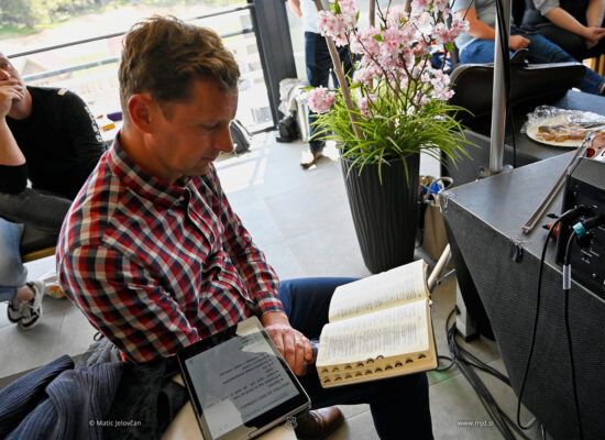
This edition was developed with a particular emphasis on reflection and engagement with the text. The layout incorporates generous margins and dedicated space for notes, allowing readers to record observations, references, prayers, and personal insights directly alongside the biblical text.
The project involved careful consideration of typography, page architecture, hierarchy, and readability across hundreds of pages. Every decision was made with the goal of supporting long-term reading while respecting the character and significance of the publication.
The cover was redesigned alongside the interior, creating a cohesive relationship between the physical object and the reading experience it contains.
Projects of this nature remind me that typography is not merely a matter of aesthetics. It is a tool for helping people engage more deeply with information, ideas, and in this case, Scripture.


Learn more through the Bible Society of Slovenia.