Some projects begin with a blank canvas. Others begin with decades of history.
When the Bible Society of Slovenia asked me to refresh the appearance of Biblija.net, the goal wasn’t to replace a well-known resource—it was to make it more approachable for today’s users while respecting the technical foundations that had served it faithfully for many years.
Originally launched in the late 1990s, Biblija.net has helped countless people search, read and study Scripture online. Like many long-lived digital projects, however, its visual language reflected the era in which it was created. Expectations for readability, navigation and usability have changed significantly since then.
The challenge wasn’t simply to make the website look more modern.
It was to improve the experience without disrupting a resource that many people already knew and trusted.
Designing Within Constraints
Unlike many contemporary websites, Biblija.net could not simply be rebuilt from scratch. Much of the existing application relied on older technologies, making a complete redevelopment impractical at the time.
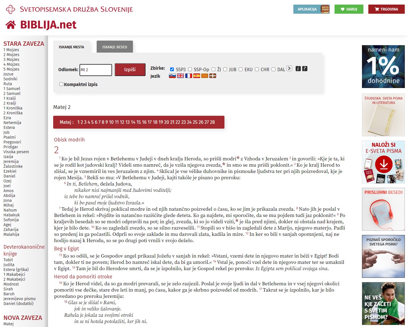
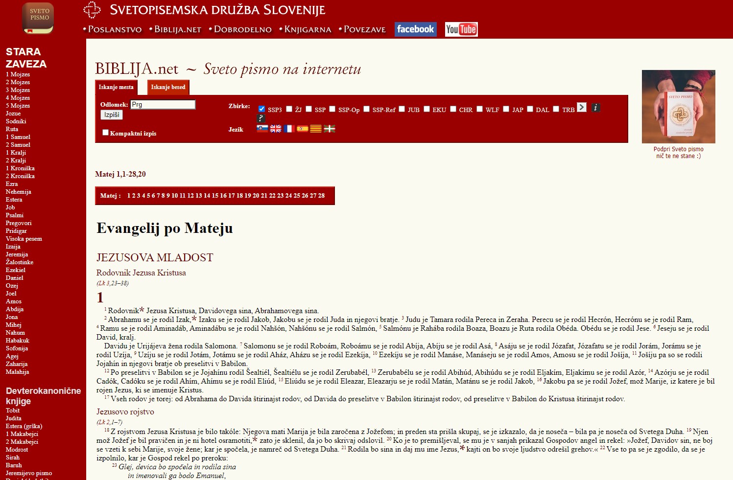
Instead, the project focused on what could be improved while preserving the underlying system. The redesign was achieved primarily through CSS, carefully working within the existing structure rather than replacing it.
Designing within constraints often requires more thought than designing without them. Every visual improvement must respect technical limitations while still delivering a noticeably better experience.
Experience Before Appearance
Visual design is rarely just about aesthetics.
Typography affects readability.
Spacing influences comprehension.
Hierarchy guides attention.
Colour helps users recognise what matters.
These seemingly small decisions shape how comfortably people can interact with information, often without consciously noticing them.
In projects like this, success isn’t measured by whether visitors admire the interface. It’s measured by whether they can focus on the content instead of the design.
Good Design Respects Continuity
Not every improvement needs to be revolutionary.
Sometimes the most effective design work is almost invisible. Users simply find a website easier to use, easier to read and more welcoming, while still recognising the resource they’ve trusted for years.
That balance between continuity and improvement is often where thoughtful design creates the greatest long-term value.
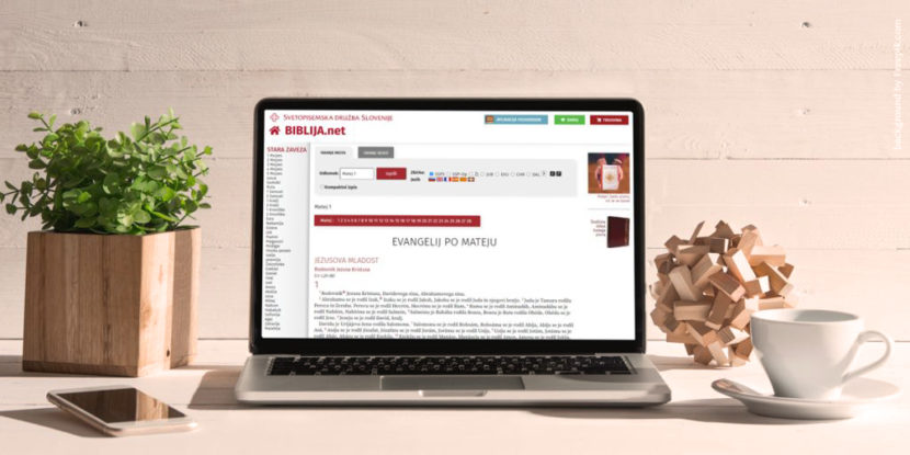
Below you can see the interface after the update.